Carolina Digital Repository
While I was at University of North Carolina at Chapel Hill, I helped The Repository Application Team to research, design, and develop the new digital repositories that served thousands of the university community members.
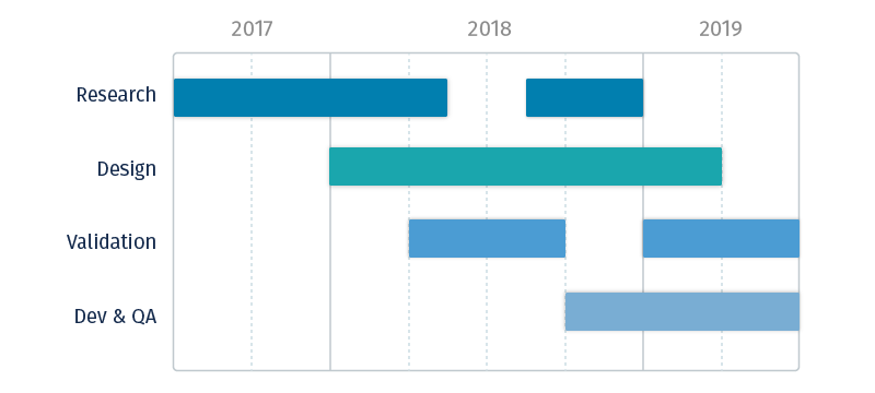
Up until 2019, both the academic contents and the libraries' historical archives lived in a monolithic repository system — this was a major source of growing pain when it comes to content discovery and usability, and the situation only worsened as more contents were added into the repository.
Thus came "The Great Migration" initiative. The plan was to...
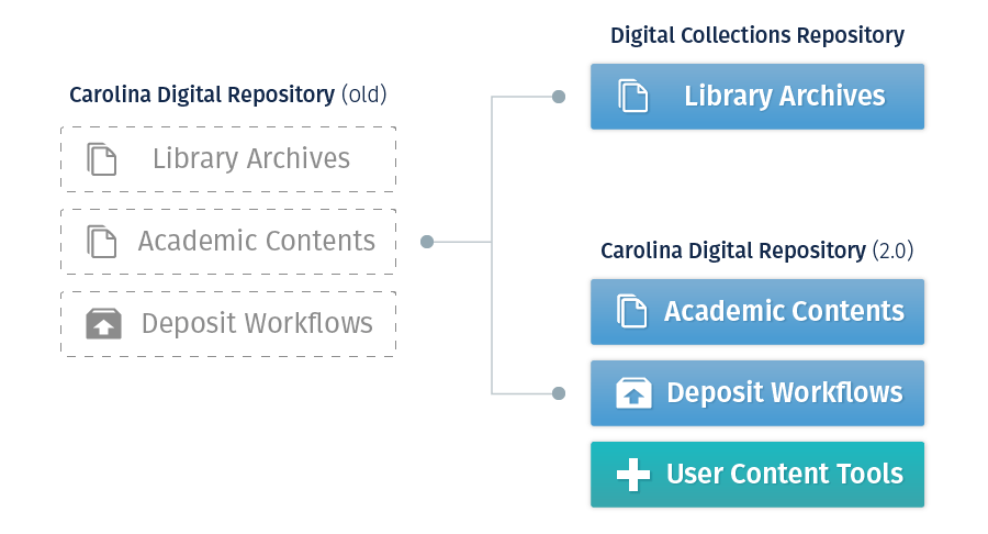
First migrate the academic contents to a new open source system, let it inherit the Carolina Digital Repository name (CDR 2.0), and develop new and urgently needed features on top of it.
Then rename the legacy platform to Digital Collections Repository (DCR). Without having to devise workarounds, this would allow the old platform be optimized for easier maintenance in the long run.
From a product stand point, these were the main goals we aimed for:
Through achieving these goals, our hope was that the migration would bring significant UX and productivity improvements to both platforms overall.
Coming in right at the cusp of the migration kickoff planning, I filled in the much needed UX functions for the team and led all the relevant efforts to ensure our success — whether it's interviewing stakeholders, conducting accessibility evaluations, testing with end users, or presenting to leadership.
As I have front-end skills myself, I also supported the developers in some of the code and quality assurance work.
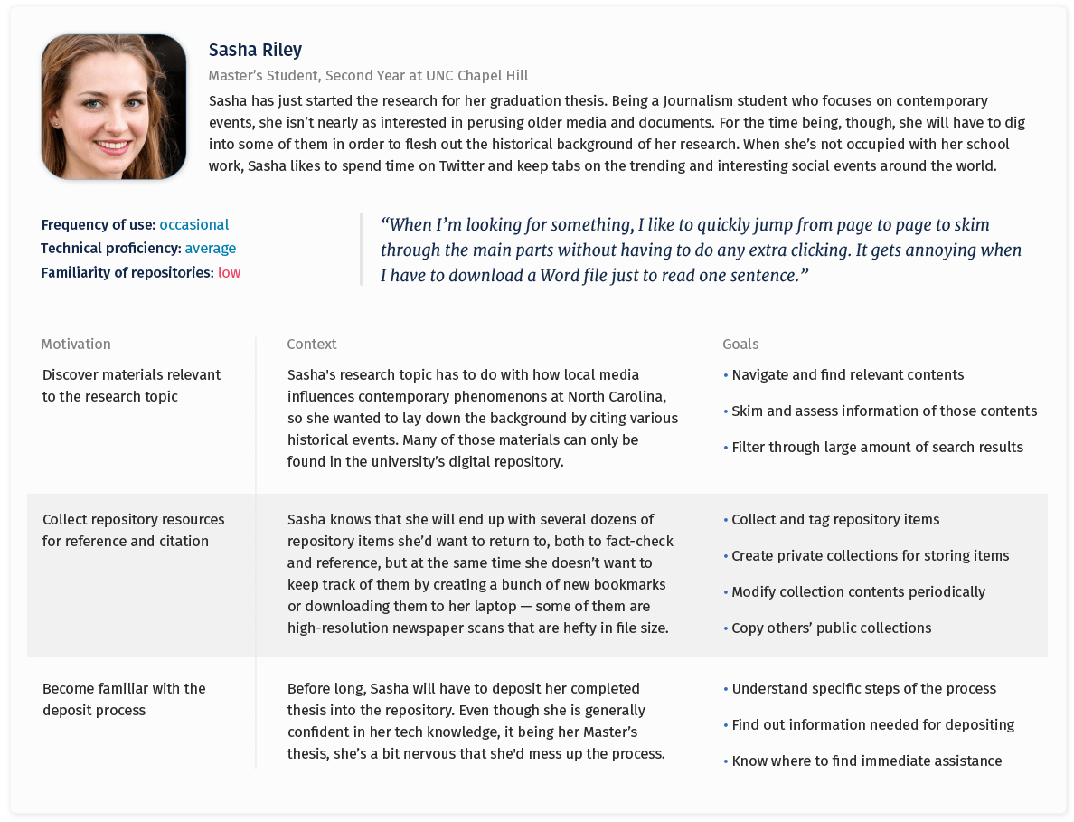
Before the split, it was harder to pinpoint which group of users were using the platform for what purposes; the team had a limited knowledge of their goals, needs, and challenges.
To make sure that we better understand our demographics, I consolidated my own research with community insights and defined these personas.



Later on, I also had a chance to dig into a decade worth of web analytics. Going through the hundred thousands of unique data points revealed interesting behavioral patterns that were previously unknown. These insights helped us prioritize subsequent design and development decisions.
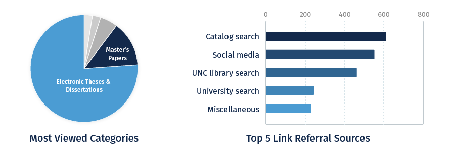
Key research takeaways:
As the new platform came with a prebuilt UI made by the open source community, we mainly focused on making adjustments and tweaking features to better fit our use cases. To better understand how the changes we introduced impacted the UX, I designed a formal lab test as a part of my research thesis — the full paper can be found here.
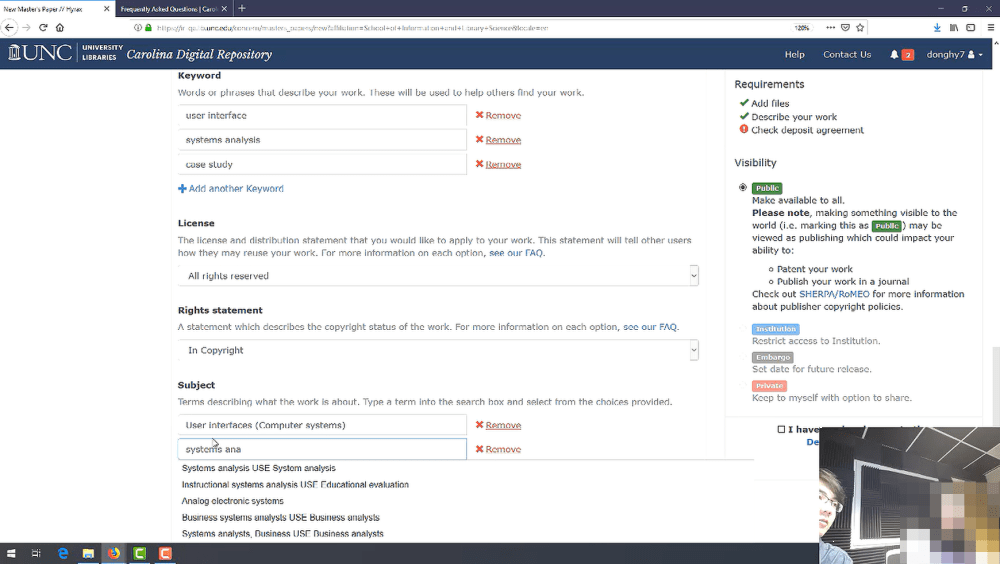
This was done with the alpha release of the new CDR 2.0 platform. The findings were subsequently used to introduce specific workflow improvements to better prepare for the public launch.
Here are some noteworthy observations from the usability test:
"It must be somewhere but I guess I just didn’t see it."
The most severe instance of self-blame ... was due to the participant's perceived inability to complete the task.
"What's the difference between keyword and subject?"
Even after reading the form label instruction, most participants could not clearly explain the reasoning of having two fields that serve a similar purpose.
For the DCR legacy platform, the design efforts mainly went into improving the most pressing UX issues that were overlooked throughout the years of ad-hoc development — surrounding the areas of navigation, discovery, and content viewing.
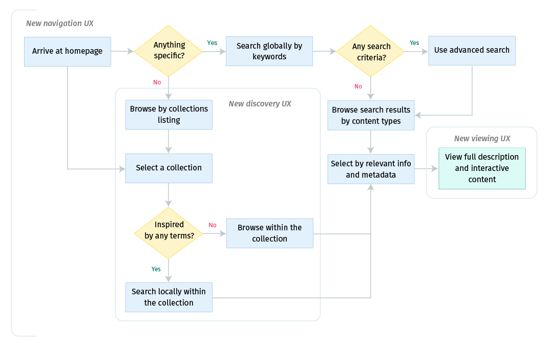
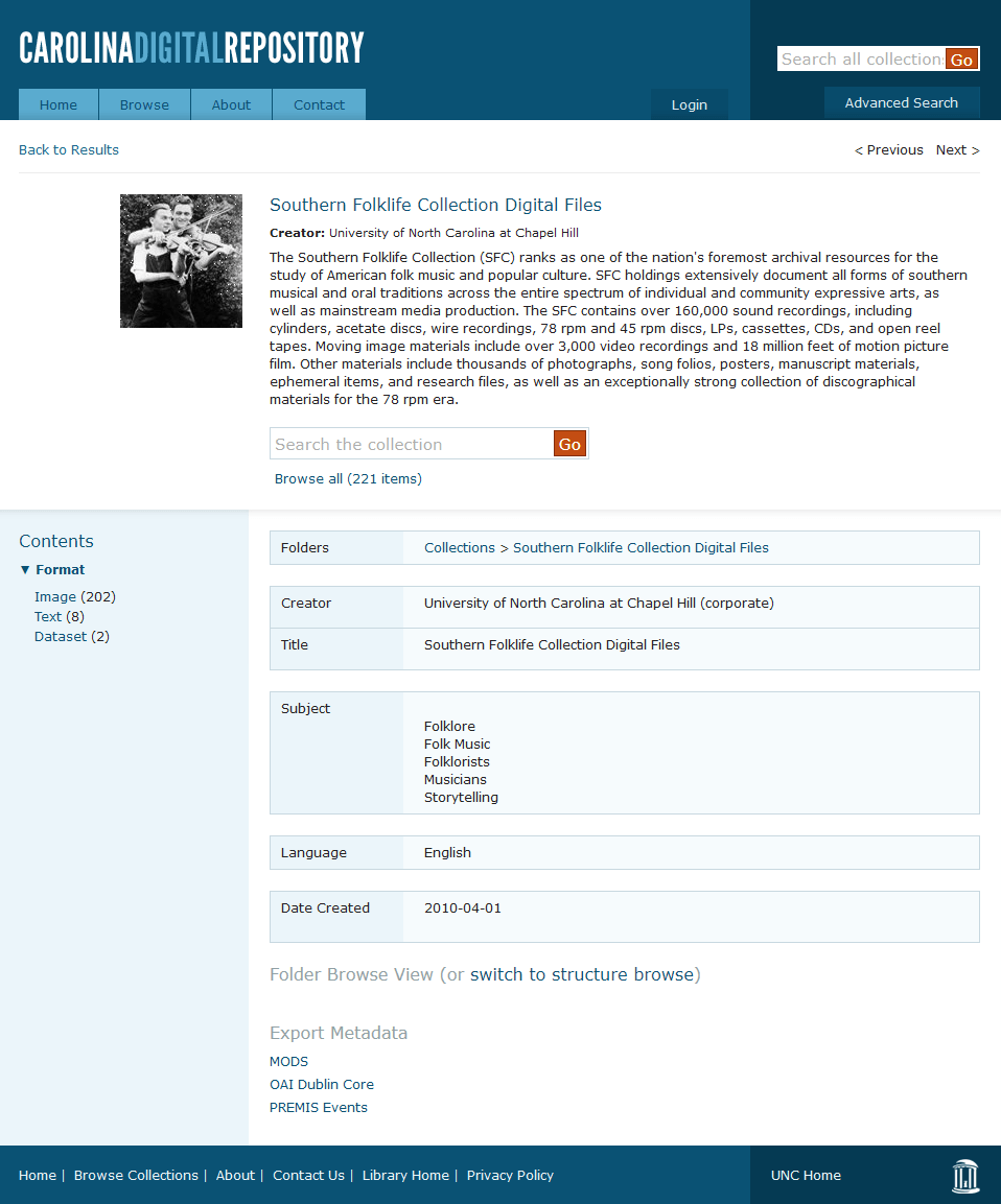
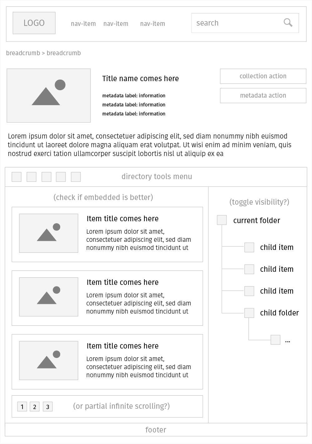
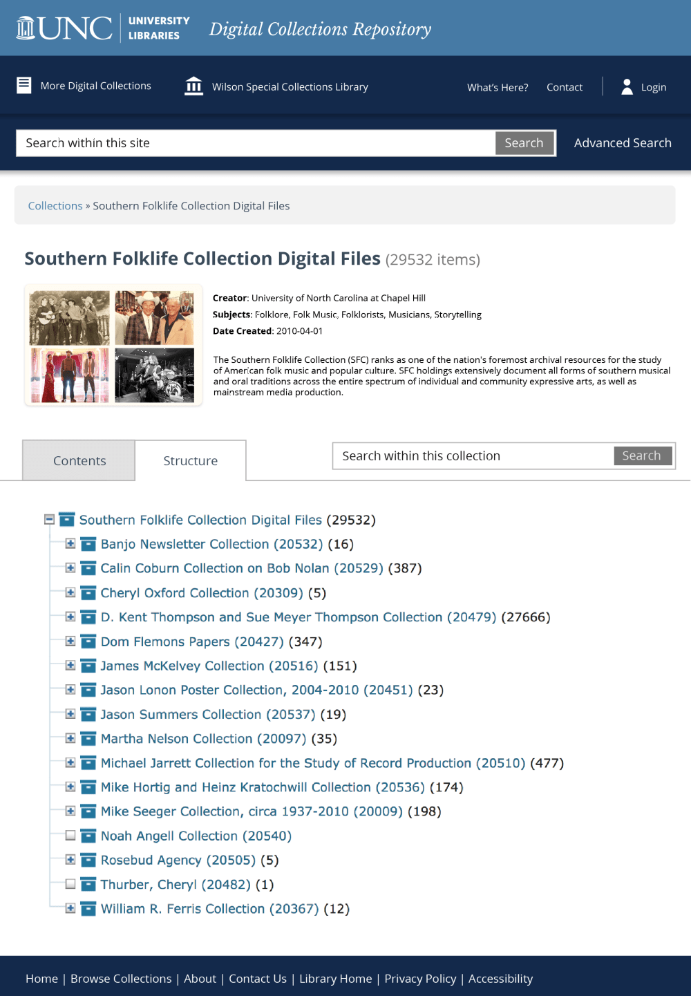
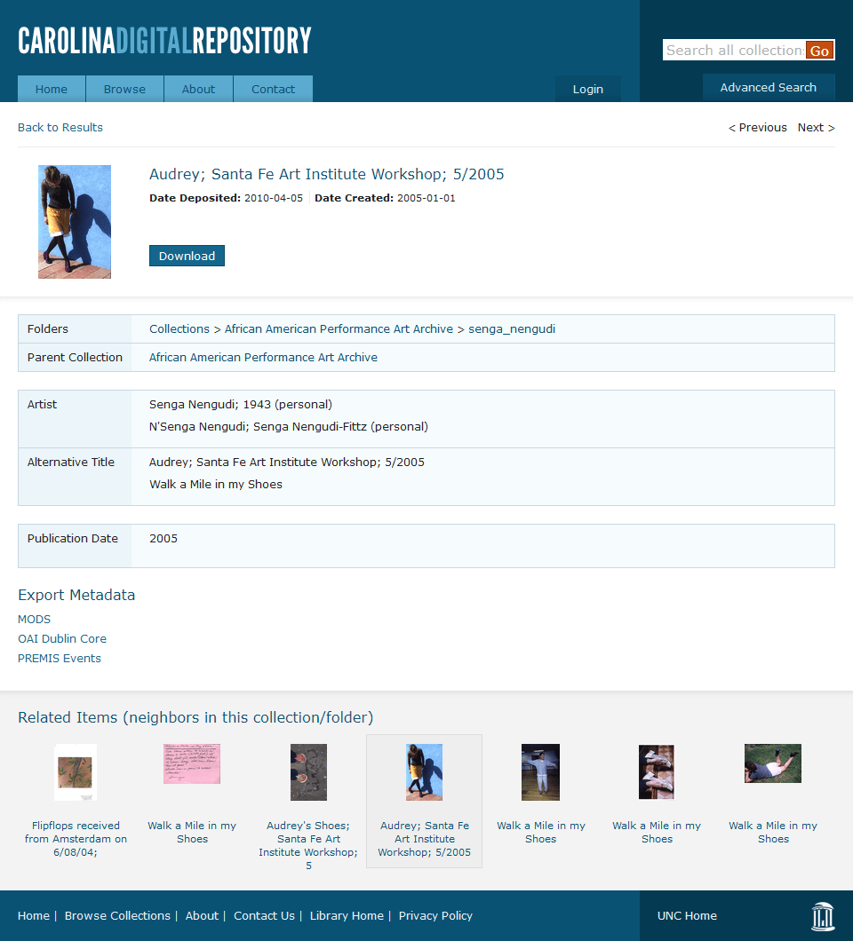
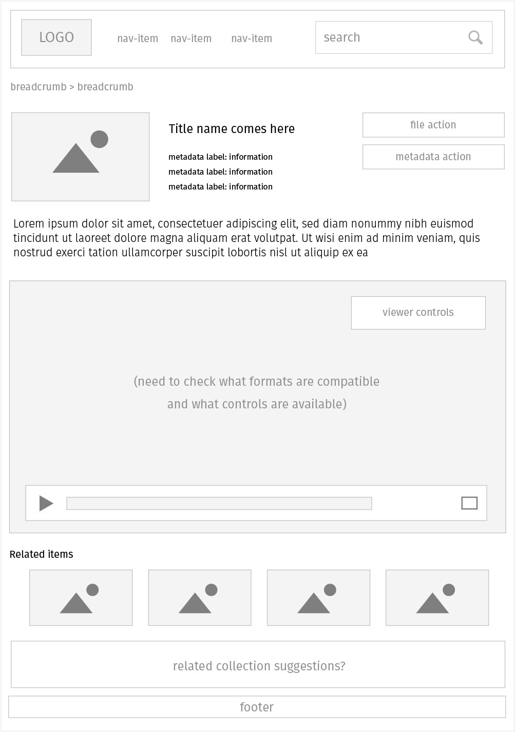
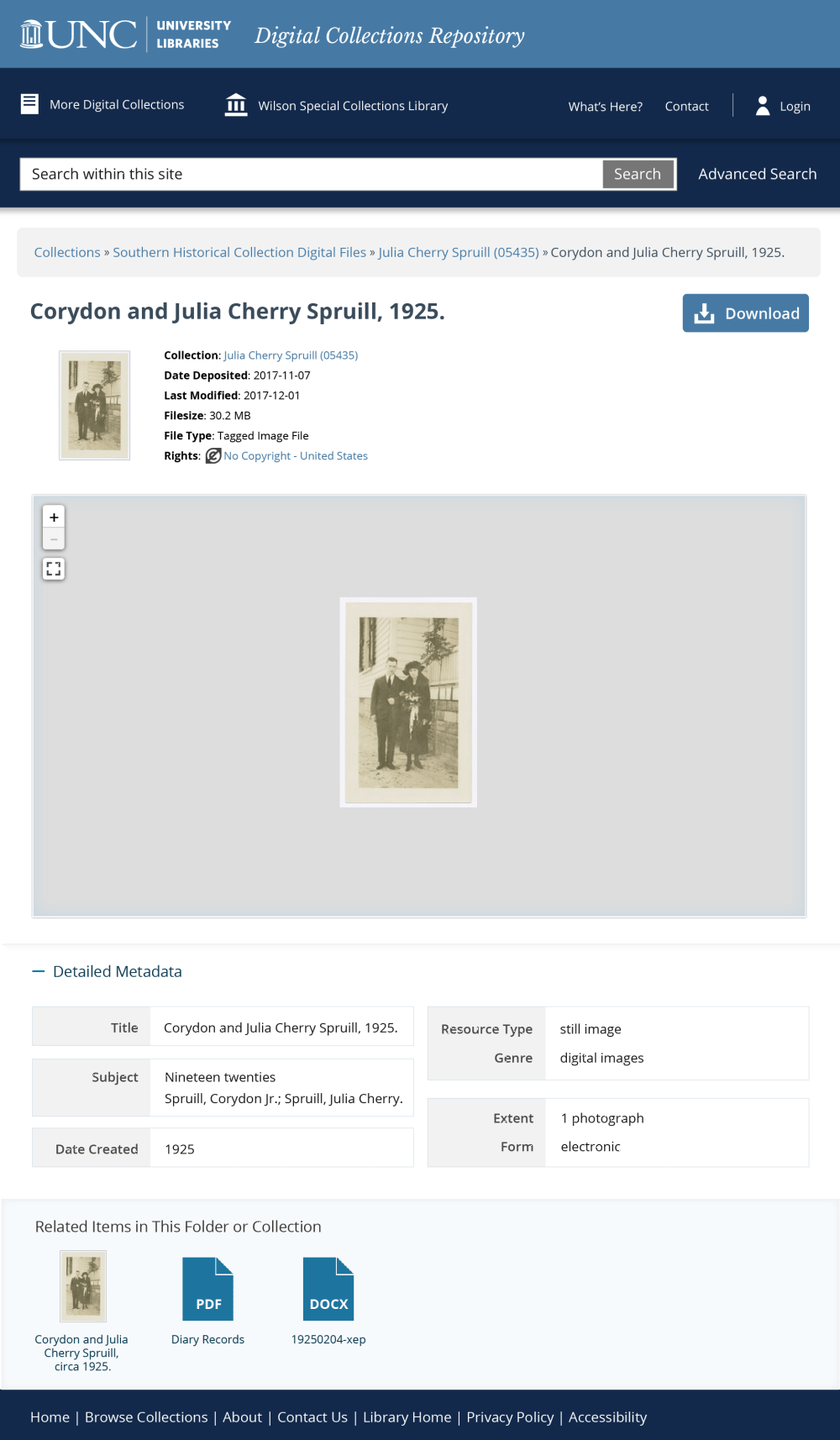
On top of UX improvements, the platform also needed a facelift to enhance its visual aesthetics as well as to bring it closer to the current UNC brand.
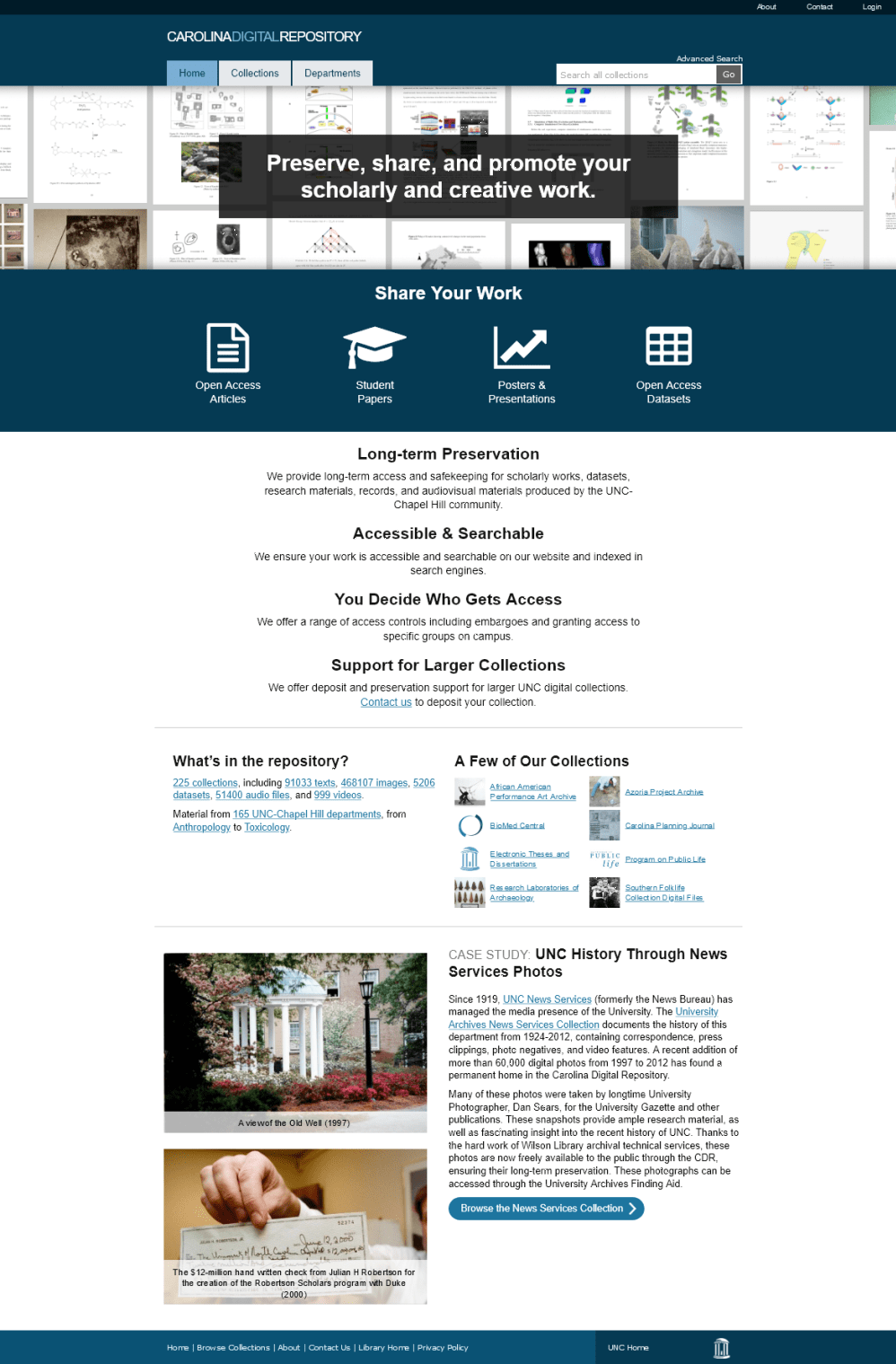
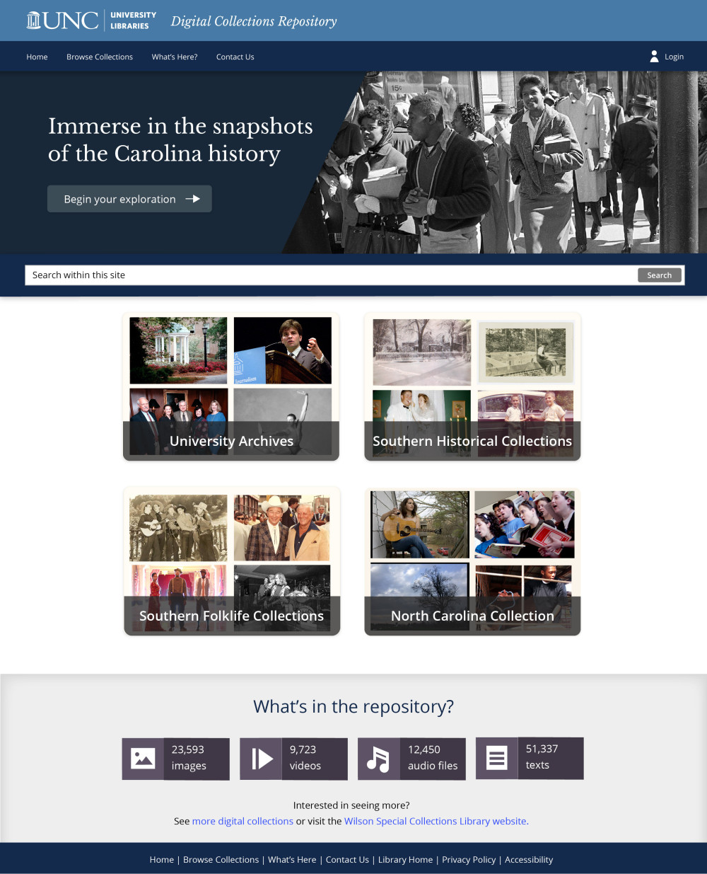
Along with internal testing, feedback gathering, and other relevant activities, the redesign of DCR spanned across five iterations, with over 20+ designed screens from wireframes to mockups of various fidelity levels.
At one point, our lead developer suggested that the UX for the admin interface could also be further improved — it dawned on me that we've been focusing so much on the public side of things that we neglected the needs of our colleagues who use the system most frequently.
After some back and forth discussions, we came up with two universal rules for the new system logic:
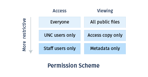
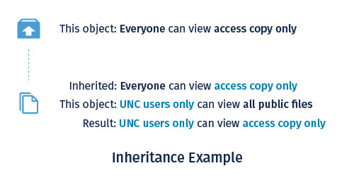
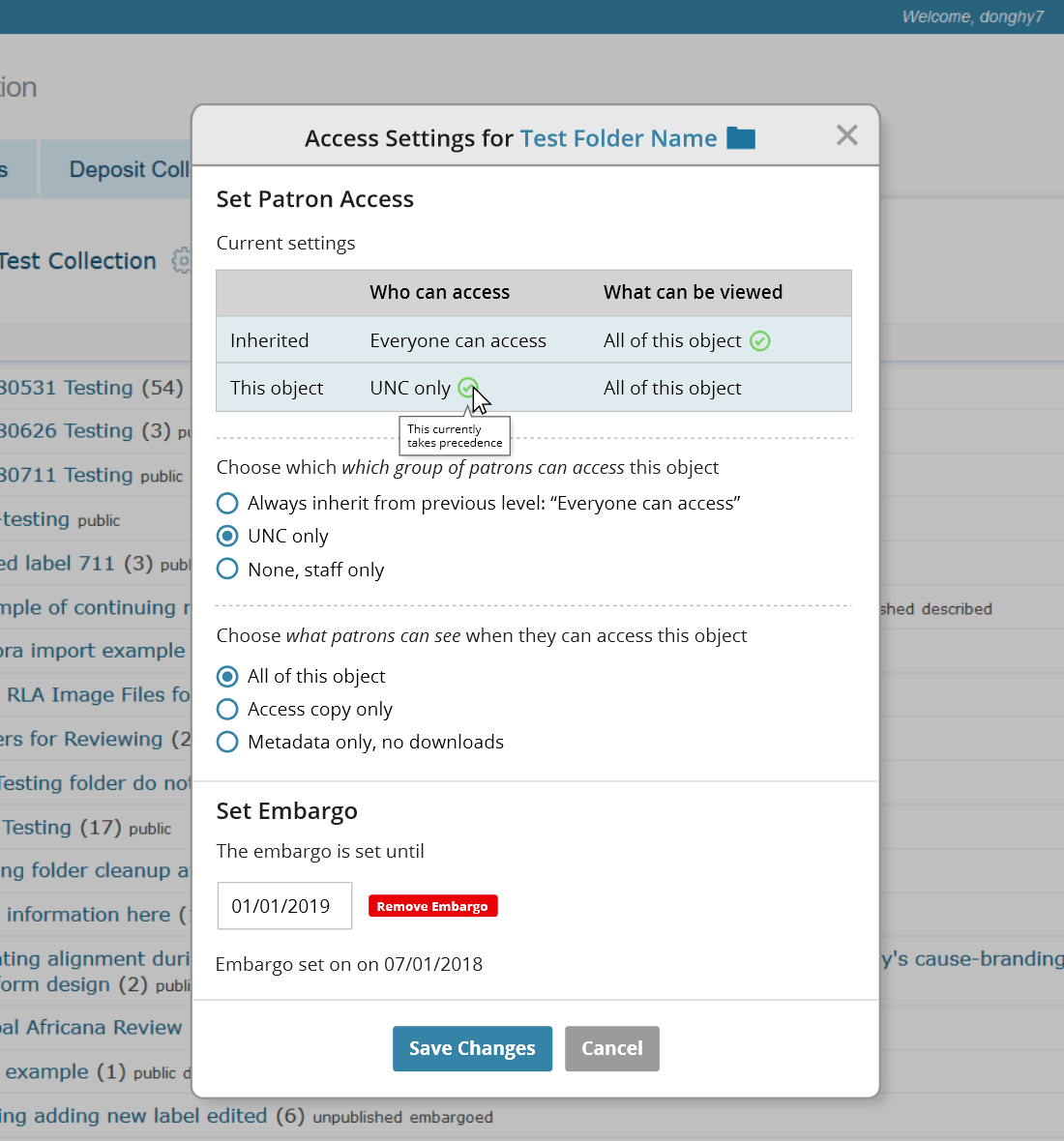
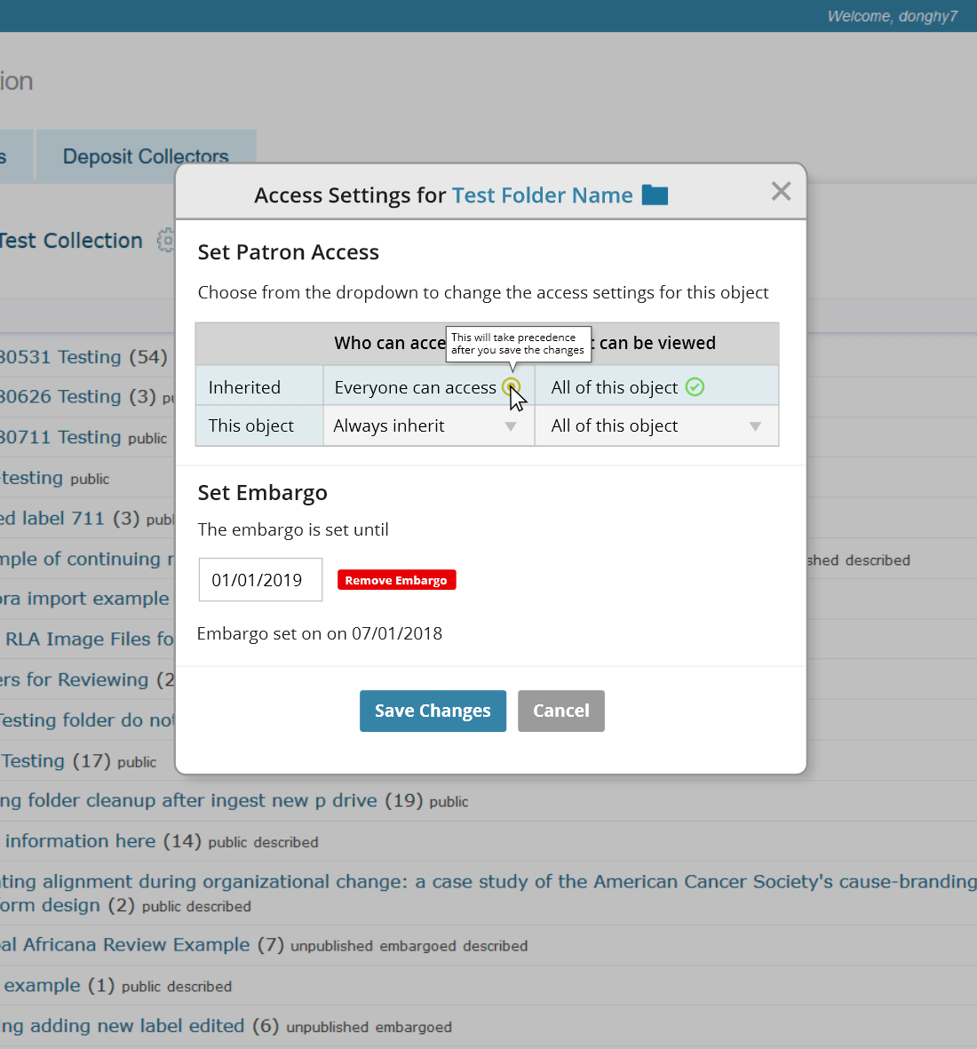
Given the sprawling content and the amount of nested directories, I prioritized one goal for our design explorations: make it easy for users to understand how access level changes through an intuitive control scheme.
As of the time of this writing, there is still much work left to be done. After all, the team consists of only a few members and there is no longer a dedicated UX specialist on staff. (The 2020 COVID pandemic surely didn't help with public funding either.)
Both platforms have been officially launched since my departure — here are the link to CDR and link to DCR. Many parts deviated from the intended visual design to a varying degree for the reason above. Though thankfully, the underlying UX improvements are in place.
If I were given once chance to do it differently, I would de-prioritize the amount of time spent on the high-fidelity drafts and work more closely with the developers on the front-end design when I was still with the team, so to make sure that the live version would mirror the my designs more closely.
With all that said, I'm still glad I was able to help create a more accessible and user-friendly experience for the communities. That's the least I could do to repay the university for a great education.