My First Ever UX Role

In the summer of 2013, I interned with the application UX team at Tyler Technologies to research and design for a mobile app concept, Munis Delivery. Over the span of ten weeks, I brought the concept from a brief paragraph of description to a completed interactive prototype.

RESEARCH Contextual Inquiry with On-site Workers

Minus Delivery was conceptualized to be an on-the-road companion app to the warehouse management software — to aid warehouse staff of public institutions in their delivery tasks.

The exact needs that the app should fulfill, however, were not clear from the beginning; this was an entirely new scenario that the team hadn't tackled before, as most of the work was done on the in-house platforms, such as desktop and web apps.

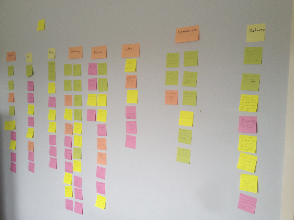
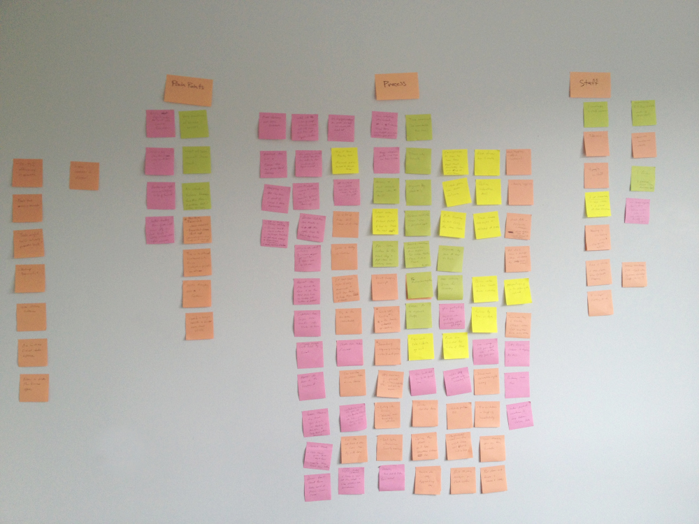
To bridge this lack of understanding, we arranged five interviews with different delivery staff from a number of customer sites. This process led to an abundance of notes and insights that we organized into key categories during a series of workshop.

Mapping of user sentiments to key tasks and categories
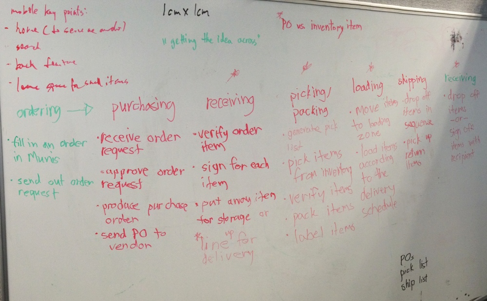
Breaking down the individual steps of the physical workflow (and gracefully written with my injured hand)

A few interesting insights from this stage:

  • The delivery team size and effort invested were varied across the board. Some were as small as one-person team and some others had a fleet of dedicated drivers.
  • Despite the differences in headcount and logistics, the delivery process remains largely consistent and the key tasks completed are similar.
  • Everyone wished or hinted at wanting to complete some of the tasks they do on the PC software when they are away from the office.
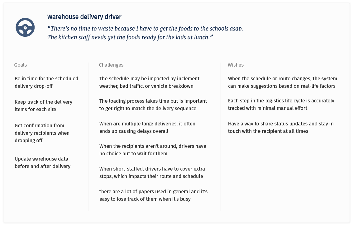
A simplified persona profile based on the research above

DESIGN From Whiteboard Sketching to Prototyping

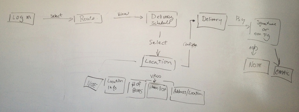
After the initial interviews, we followed up with further questions and clarified doubts with our users. We then distilled the key tasks into a userflow that captures the essential aspects of a delivery process.

The core user flow captured synthesized from the research

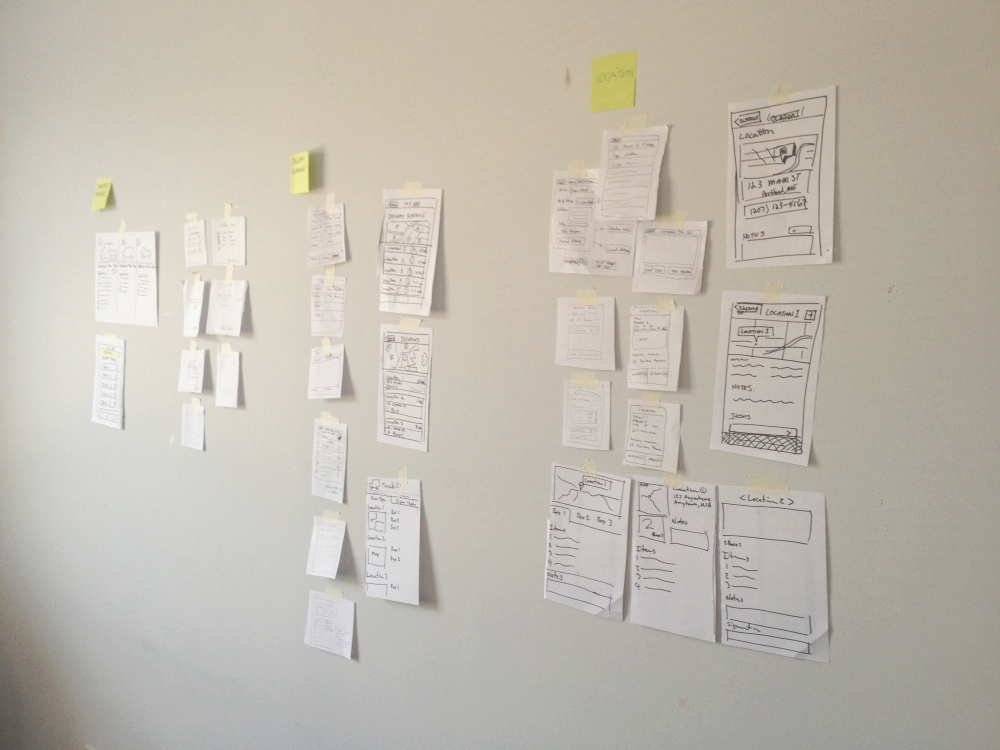
With this flow captured, I quickly iterated on a few early versions of the prototype and solicited feedback from the team for further improvements.

Iterating on the user flow through paper prototypes

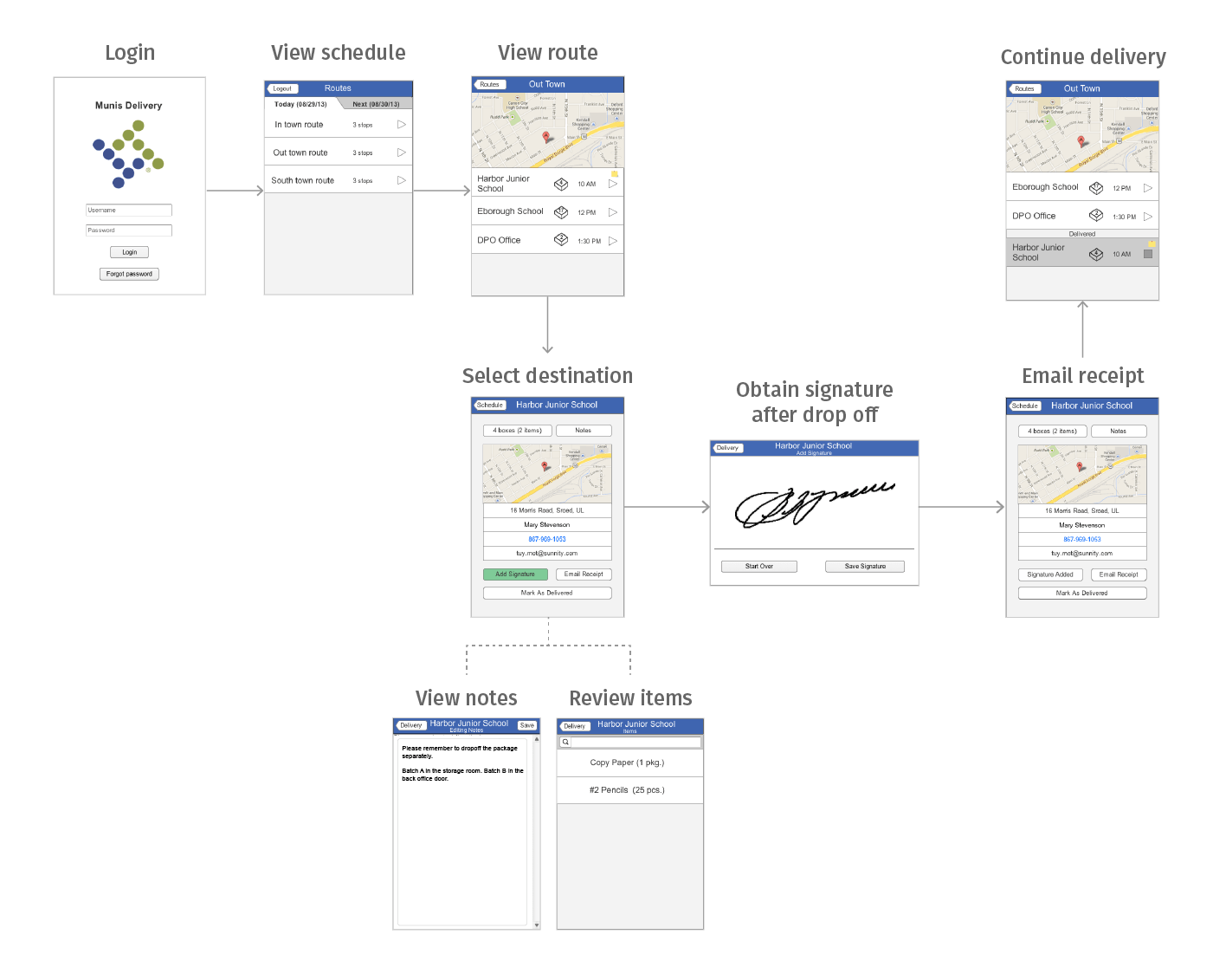
Later on, I created a low-fidelity interactive prototype in Axure and we invited three of the interviewees to return for a remote usability test. The selected participants were all provided with a context and three tasks to complete, and then we followed up with a Q&A segment at the end.

A partial sample of screens for the main delivery workflow

While all test users expressed that the features shown in the prototype would improve their delivery process, they hoped to see the app to be used in their real context.

AFTERWORD A Brief Reflection

Since this was an end-to-end UX internship, the bulk of the time was spent on the upfront research, analysis, and ideation; there was barely enough time to wrap up the first draft of Axure prototype design at the end.

In other words, there was still much work left to be done before this companion product was market-ready. For instance: As the prototype was operated on a PC and the drivers were sitting in front of a desk, the assessment only tested for the basic viability of the concept. Testing with real data during an actual delivery would be essential in this regard.

Retrospectively, if I had more time, I would also consider conducting a thorough study in the workers' office to see a full picture of the warehouse operations. An ideal design can only be achieved by understanding the connection between the in-house and delivery workflows — otherwise I would run the risk of producing an incoherent product and actually undermine my own work.